What is it ?
Color correction is the technical process of manipulation of the image/video with the purpose of correctly representing the colors of the desired file.
Fundamentals:
There can be many reasons why your images colors aren’t represented correctly. Some of them are improper exposure, wrong white balance settings, problematic environmental lightning, high ISO settings on your camera (digital cameras only), multiple sources of lightning with drastically different color tonality.
There are two terms, which people sometimes used interchangeably but are not the same, color correction and color grading. For the sake of the article, we will call them CC and CG.
In this article we’re discussing CC basics, technical aspects and how to do it properly.
CG is the process of changing the color of your image to get a certain style, look or “feel”. Some of the CG processes are B&W, Sepia, complementary color scheme, and many more.
They can involve a certain type of colors as pastel, chrome, metallic, high contrast but we won’t go into details. Important thing to know is, if you become familiar with color correction processes, you will effectively get at least 80% of knowledge needed for accurate CG.
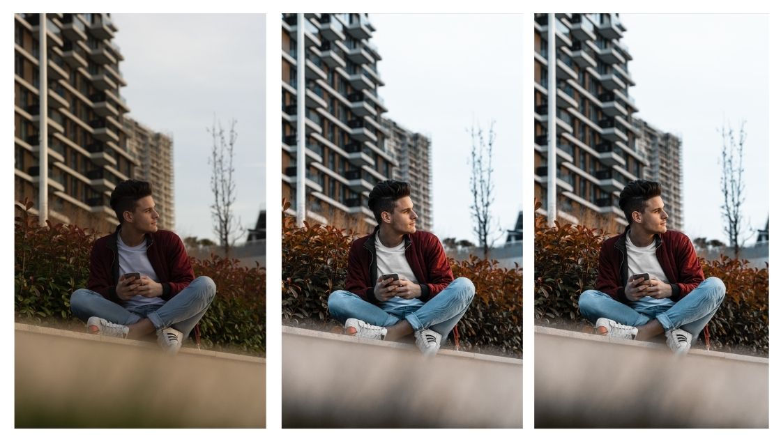
There are multiple online articles claiming you should first do a color correction before color grading but they are factually incorrect. If you have both the knowledge of CC and CG, you will do it at the same time. Check the image samples below:
Image “original” is the raw file took straight from the camera. As we can see (hopefully :)) there is a slight yellowish tint that prevails across the whole image and not enough magenta.

The below image has been CCed, effectively giving us the “true” color and exposure.
There isn’t huge difference as it shouldn’t be because it means that we properly exposed and set the white ballance before we made the shot. Pay attention to the exposure of the sky. We increased the overall exposure of the whole image while keeping the brightness levels of the sky as they were on the “Original” file.

Third and final image sample is the one that was CG to my taste. As you can see, it’s exposure, especially the part of the sky is overexposed but I did it on purpose as it gave my image the vibe I was looking for and simply put, I think it looks awesome. 🙂
Additionally, I’ve removed the yellow color completely and did many local adjustments such as shirt and snickers brightening, local dodging and burning, skin retouch, blue color warmth change.

Technical Aspects & Role of Equipment:
There are a few technical aspects revolving around CC and CG that you should know and (eventually) have.
Monitor – There are many types of monitors such as TN, VA, IPS, LED, OLED. There are different technologies as to how they are made, as well as the actual process of creating the picture which effectively gives different output on your screen. Since we’re covering the basics here, we should hold onto one of them and that is the IPS panel. In basic sense, it gives the most accurate color representation as to what it would look like if you were to print it. Aside from the printing part,it’s important to use the monitor with the most accurate colors as it will effectively look the best across the multiple devices users may look at your files. One display can show the colors slightly yellowish, other one slightly greenish but the middle ground is the “true” ground or the correct color you want to work with. Since August 2020 when this article was written, IPS panels have became super cheap and you can easily find one on large trading platforms for pocket change. That said, it doesn’t mean IPS panel for 30$ and the one for 3000$ will give the quality and output but it’s the starting point.
Color calibration – It is the process of fine-tuning of your display as to give you the most correct colour and brightness levels as it’s the primary purpose, and many more fine-tunings that are far to technical and won’t be discussed here. Usually, if you’re buying IPS panel in a price range of 300$ or more, the monitor will be pre-calibrated out of the box and it’s usually more than enough as a starting point. If you have some other type of panel instead of IPS, especially TN and VA, you can most certainly expect the colours to go way off. As a real life example, I have two monitors at this very moment in front of me. One is hi-end IPS panel for professional work while the other is a cheap TN panel .
While my hi-end panel colour values are 50-50-48 for red, green and blue chanel, my TN display values are 28 36 11. Just to give you as a perspective, values should be closest to 50 50 50, which effectively makes my cheap panel with default values look like a total crap. Anyway, enough about calibration.
Know-how:
There are a few basic tools for Color Correction. Since we are talking about photo color correction I’ll stick with Adobe Photoshop.
When opening files in PS, I suggest using Camera Raw filter first. It gives you a lot of flexibility for CC the files. It can also be used to process multiple images at the same time (similar to Lightroom) and you won’t have to look trough all of the PS main interface tools looking for simple sliders such as white ballance, exposure, level, vibrance, saturation, sharpening etc. Now let’s go trough basics of CC.
White ballance – default (as shot) shows the defult input of your colors you took with your camera/phone/tablet. By default your colors will always be off at least by a bit. I suggest you use it as a first tool for CC your images. You can try with the drop-down menu and sellecting “auto” and see if it looks the way it is supposed to. If you want more manual approach (which I wholeheartedly suggest) you should try using the sliders “temperature” and “tint” with the accent on “temperature” because most of the images have skewed blue-light color ballance. As for the “tint” slider, I often bump it up a bit toward magenta as it usually gives better output, especially on skin tones.
Exposure – Your basic “brightness” slider. You should move it up or down untill you get the desired image brightness. As a general rule, I suggest you look at the histogram at the top of the page and the way it moves. In general, all “properly” exposed images should have a visible spectrum on both the left and right part of the slider.
Properly exposed image should look something like this:

The “dark” part is represented on the left side while the “light” part on the right. As you can see, the the light part of the slider ends before the “end” of the window, just above number 235, meaning there are missing light tones (bright area), which could be easily bumped up by clickind and draging the white point above the number 235. It is especially important to pay attention to the bright part of the image as small correction such as this one could make your image pop out a lot more and give it a more professional look. In summary, if you are not sure if the image is properly exposed, always refer to the levels tab and check your image parametres. Quick suggestion, always make sure that the small “belly” and big “belly” are on the left and right side respectively. If it’s there is one belly in the middle, it means your image has too much mid tones across the spectrum and will look less contrasty and bland.
Vibrance/Saturation – are sliders which reflect the overall quantity of color on your image. There are differences between them but I won’t go into details. They can be used interchangeably and should be used that way for the best output. Move them left and right untill you get the desired result.
I personally do not use them that much, since the white ballance sliders along with the HSL adjustments give me all the control I need. More on that below.
HSL adjustments – They are located as the 4th tab in the camera raw filter and there are 3 tabs in total, hue, saturation and luminance. Simply put, it’s the all around adjustment you’ll be using for all of your image color settings. Hue tab lets you change the specific colour warmth, meaning yo can make any specific color to another color. For example, if you want image without blue tone, but you want to keep cyan tone, which is the nearest tone to the blue one, you can select blue tone and with the hue slider change it to cyan without too much of a hussle. Saturation tab, as its name suggest allows you to change quantity of a certain color across the whole image. You don’t want a certain colour in your image or a nasty reflection from some other element in the image, simply hold the slider and drag it on the left.
Vibrance tab is a bit different, basically what it does, it let you brighten or darken certain color on your image. If you have a yellow tone you would prefer to give it a gold feel you simply drag the slider left and darken the yellow tone. In layman terms, it keeps your color as it is, only changing it its brightness.
So from bright red all the way to deep dark red, almost black. As a final note, I suggest you stick with the hue and saturation tabs. Vibrance tab can be useful but not that much in regard to the CC.
Thanks Luka for a great article. Loved how you explained the role of monitors.